
Designed a feature reducing the time users spent searching for something to watch.

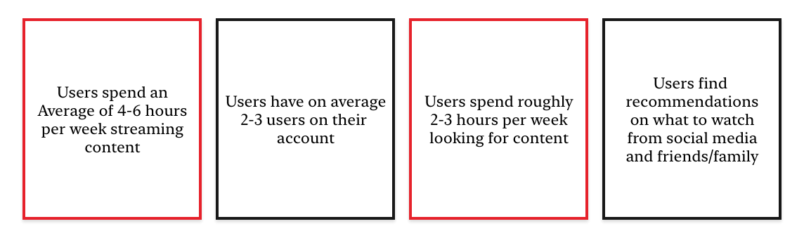
Having typically used Netflix on a laptop or television, I had to go through the process of downloading the mobile application to my iPhone. After playing around with the app and writing down my initial thoughts, I conducted some secondary research to better understand the current state of the video streaming industry. In doing so, some fascinating statistics emerged:
With secondary research in-hand, I moved into defining Netflix’s current business & user: problems & outcomes using a Lean UX Canvas, comparing direct and indirect competitors in a Feature Comparison Analysis, and developing a to determine our “Blue Ocean”.
I used the competitor feature analysis to get a general understanding of what features are offered from direct and indirect companies. Included in the analysis were a number of features, such as:

Once everything was laid out, I focused on the emerging trends of Share-ability & Personalization.
To determine Netflix’s current market position, we applied the themes of Share-ability & Personalization to the x & y-Axis on the Market Positioning Analysis tool.

In simple terms, it is is the discovery of an area within the marketplace that a company can introduce a product or feature that would have no competition.For Netflix, it became clear that there was an opportunity to increase mobile/tablet application downloads through the implementation of usability and connectivity features.
Having the Blue Ocean, I was now ready to move into the final stage of empathy and gather user research.Fortunately in the era of COVID, there were a plethora of avid users we had access to… However, due to time constraints of the four day sprint, we settled with conducting four virtual interviews (zoom & phone calls) and developed a survey (received 43 responses) collecting the following key data:

To make sense of all the data, I moved into the defining stage. The defining stage employs a wide array of different tools and techniques. For this four day sprint, I implemented tools such as As-Is Mapping, a Value Proposition Canvas and Journey Mapping to uncover the problem statements and correlating “How Might We” statements.
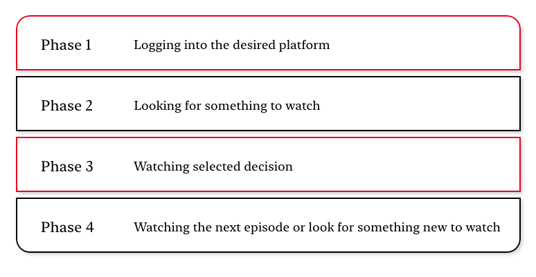
Development and visualization of an As-Is Map allowed me to breakdown the emotional and physical aspects of the user experience into four phases:
Using these four phases within the journey map, I visualized the ups and downs of the users’ emotions trying to pinpoint areas of frustration when using the Netflix platform.
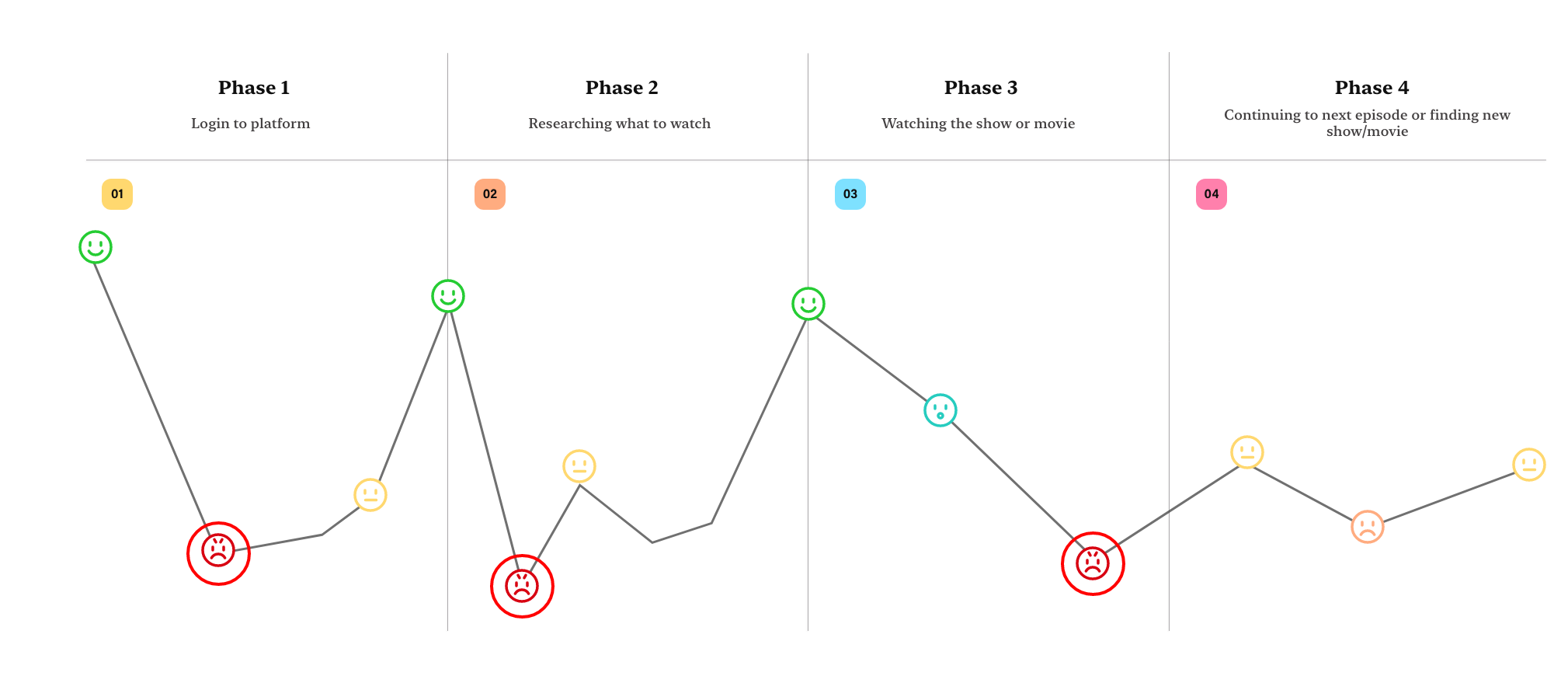
As you can see from our journey map above, majority of user frustration occurred within the first two phases of the user experience. These pain points could be a number of issues from big to small:
Keeping record of the data and areas of frustration, I developed my problem statements and correlating How Might We statements.. Problem Statements help identify gaps between the current state (i.e. the problem) and the desired state (i.e. the goal) of a process or product. While converting problem statements into “How Might We” questions, eases the tension when it comes time to brainstorm possible solutions.

“Great!! We now had our problem statements, but how are we going to develop possible solutions for each statement?”

To stay organized during the brainstorm, I used the Mind-Mapping tool, writing down each “How Might We” statement onto a sticky note and writing down any ideas or solutions that came to mind. I had to conduct a few additional brainstorming sessions with my classmates, as I initially struggled to develop solutions/features.
Once the brainstorm sessions came to a close, I took all the ideated solutions and placed them into categories of importance using the MoSCoW Method’s: “Must Have, Should Have, Could Have, Won’t Have”.

Because of the time constraints, I focused only on the “Must Have” features:
Before moving into the Lo-Fi prototyping, we developed a few iterations of user flow before finding the “Happy Path”.
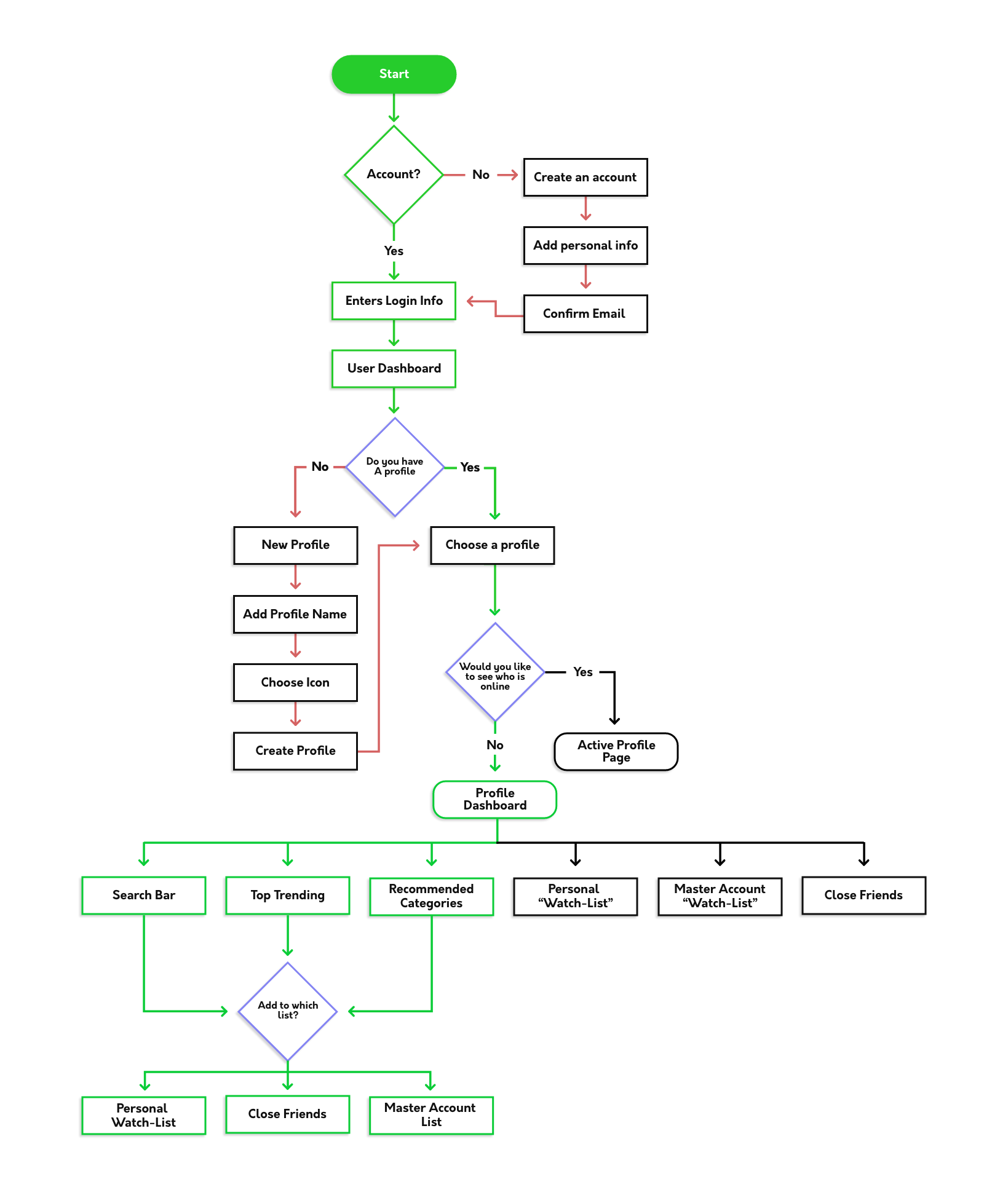
The “Happy Path” will be the shortest and most efficient method of completing the tasks we will introduce to our prototype testers.

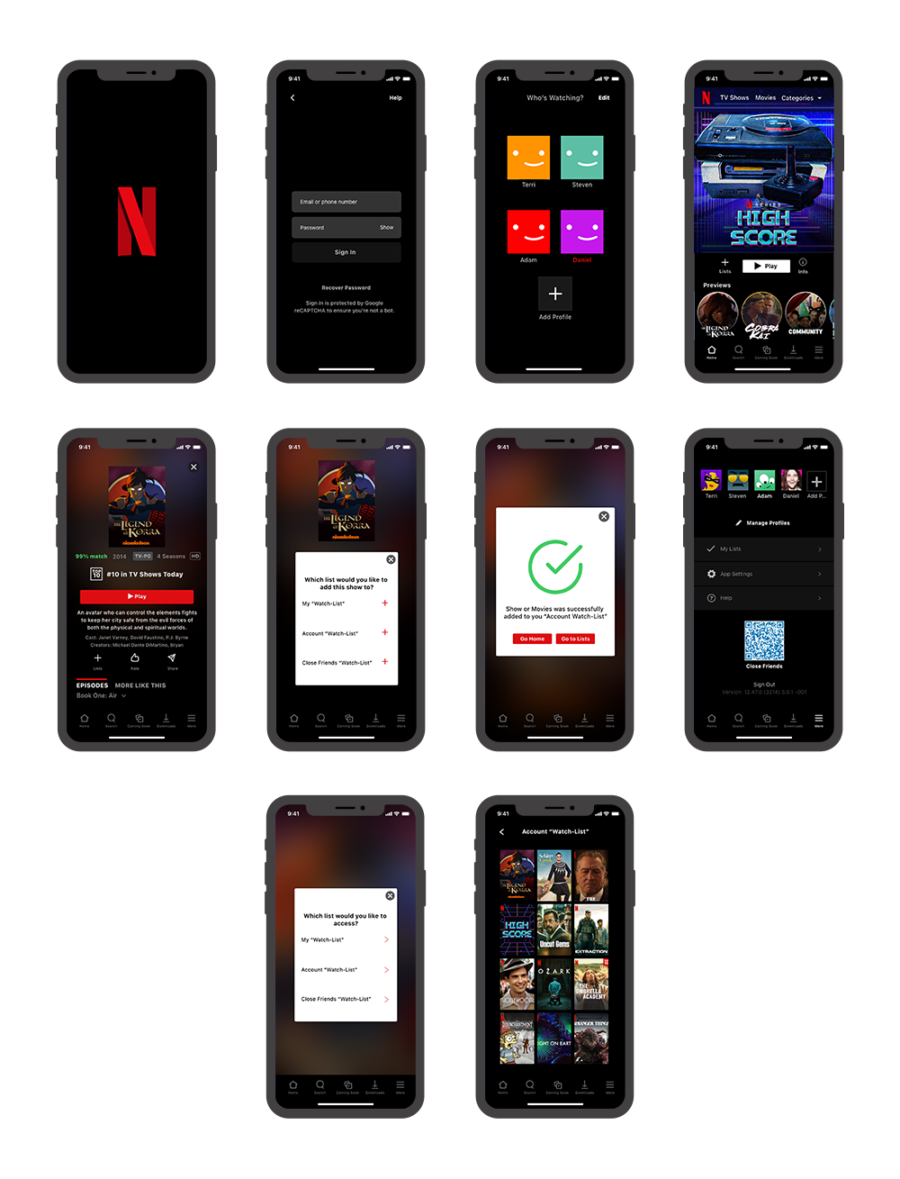
For the Lo-Fi prototype, I used the sketch book UX Wireframe Sketchbooks by Lium Martin. Disclosure: This was actually a gift from my girlfriend before I started the co-hort. If you see her, don’t let her know I use it! In order to keep track of usability metrics, I imported my hand drawn designs to Maze.Design. After successfully setting up the tasks for my user testing, I sent out the prototype to be tested. With limited time left, I turned my focus to just one new feature (Account “Family” Watchlist). Once I had quantifiable results, I noted the current metrics and hotspots and moved into Mid-Fi prototyping.
I reviewed the metrics and quotes from the lo-fi tests and developed the Mid-Fi prototype. The focus for the Mid-Fi prototype centered around the layout of current and new components for our feature.

During this testing phase, we had users complete two tasks. As you can see, we received an increase in Direct Success rates for both tasks while also reducing the Give-up/Bounce rates.
Just as fast as we made the Mid-Fi prototype, I moved on to creating the Hi-Fi prototype. Replicating the Netflix interface was a time consuming task after an already long week, but use of tools like the Atomic Design Inventory made the process just a little bit easier.
We uncovered a lot during this sprint, but there was still a lot of work to be done before we could have a functioning product. Continuing to refine our process and “failing fast” will only increase the opportunities to develop better solutions. As for nexts steps, here are a few things we would have tackled if additional time was allotted:

