Lead UX/UI Designer
May 2022 - June 2022
Along with managing data internally, brokers also faced friction in collecting completed forms and disclosures from clients. This often required manual email exchanges, leading to errors, version mismatches, and wasted time.
Research revealed not only workflow issues for brokers but also pain points for insured clients, who were often confused by emailed attachments or unsure if they had submitted the right forms. These insights shaped both the dashboard priorities for brokers and the design of the client-facing forms tool.


I sketched initial concepts and explored dashboard layouts inspired by data-rich applications from leading brands. The focus was on clear visibility of essential client data, mobile access, and actionable workflow elements. Ideas were refined through collaboration with engineers and PMs, evaluating feasibility, performance, and alignment with user needs.

The portal leveraged our company’s Design System to maintain consistent branding and interface patterns. New components were created only when necessary, ensuring style, accessibility, and usability standards were preserved.

Both broker and client-facing experiences were prototyped in Figma with realistic data and form scenarios. Usability testing included 15 brokers and 10 insured clients, validating that the portal worked well for both groups.
The feedback from these sessions was invaluable. Initial rounds highlighted challenges with quickly locating critical client information and managing workflows efficiently. Through two additional design iterations, we refined layouts, prioritized key data, and optimized navigation.
Each iteration was followed by team discussions with engineers and PMs to ensure all feedback was addressed, resulting in a polished, user-centered final design.
Creating mid-fidelity prototypes allowed us to test layout, hierarchy, and functionality before committing to high-fidelity designs. Several pivots were made during this stage to ensure the dashboard effectively highlighted essential client information and minimized cognitive load.

Final adjustments focused on improving the clarity and visibility of key data. Critical fields were prioritized, expandable sections were added for secondary details, and visual cues like color coding were used to make important information easier to identify at a glance.
Designing a tool that consolidated client information in a single portal presented several challenges. Ensuring critical data was displayed accurately, supporting mobile access, and providing intuitive workflows for brokers were particularly complex.
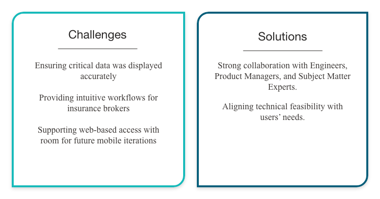
These challenges were addressed through close collaboration with engineers, product managers, and subject matter experts, allowing us to align technical feasibility with user needs.
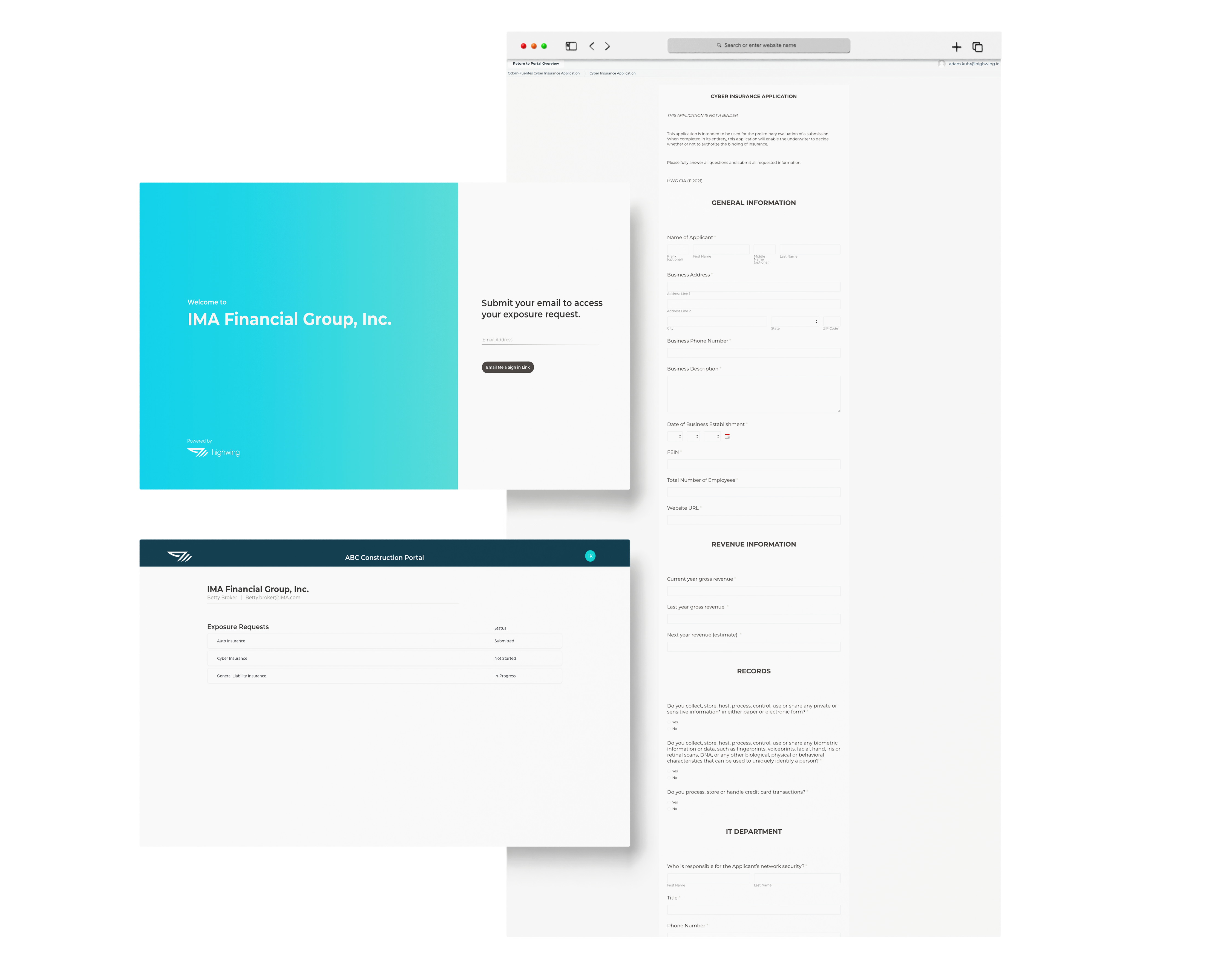
The high-fidelity prototype included approximately twenty screens, providing a seamless experience for brokers to view, update, and manage client information. The design emphasized intuitive navigation, clear presentation of critical data, and mobile responsiveness for on-the-go use.

Implementation required tight collaboration across two user flows: broker dashboards (with complex backend data handling) and client forms (with secure, one-time link access). Working closely with engineers ensured both pieces worked seamlessly together.
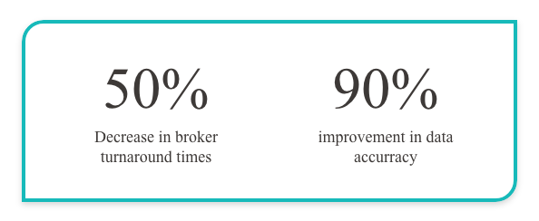
The portal launch was highly successful. After thorough quality assurance and user validation, the platform went live, leading to measurable improvements in broker efficiency. The combined solution improved efficiency across both sides: broker turnaround time dropped by 50%, data accuracy improved by 90%, and clients reported the new portal made form submission seamless and stress-free.
The combined system launched 10 weeks after conception. Brokers praised the clarity and efficiency of the dashboard, while insured clients appreciated the ease of the forms tool, many noting it was the first time submitting insurance forms felt “simple.”